Design

March 8, 2025

2 min read
Why ‘Best Practices’ Are Killing Innovation in UX
Why ‘Best Practices’ Are Killing Innovation in UX
Are we designing for users… or just playing it safe?

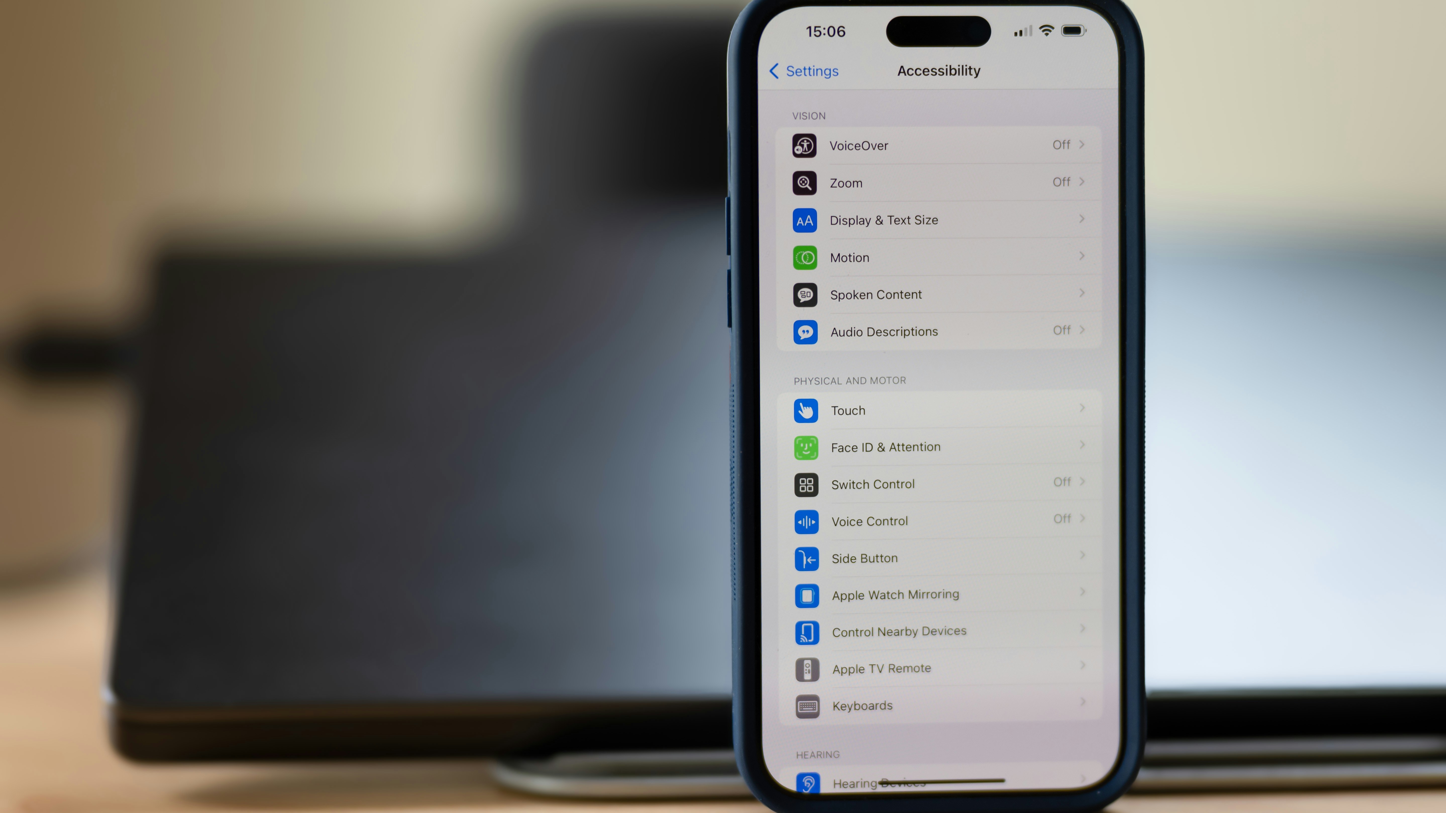
Accessibility matters: Ethically, legally, and commercially. But as a designer, knowing where to start can feel overwhelming. Inspired by the UX Design Institute’s comprehensive guide (and simplified for daily use), this checklist will help you bake accessibility into your everyday design work.


Accessibility is not optional—it’s essential.
Ethical: Everyone deserves equal access to digital products.
Legal: Many regions, like the EU with the European Accessibility Act, now require compliance.
Commercial: Over 1.3 billion people worldwide live with disabilities. Excluding them means losing customers and trust.
Before we jump into the checklist, keep these 4 core ideas in mind. They come from the WCAG accessibility standards, and they’re a great way to guide your decisions:
Perceivable – Can people see, hear or sense the content?
Operable – Can people navigate and interact with it?
Understandable – Is it clear and predictable?
Robust – Will it work across devices and assistive tech?
Think: Can everyone access and use this, no matter how they interact with the web?
1. Text & Visuals
Design starts with what people see and read.
Check colour contrast. Text should be readable against its background. Aim for WCAG AA compliance (use tools like WebAIM’s contrast checker).
Don’t rely on colour alone. If an error state is red, add text or an icon. Users with colour blindness won’t rely on colour cues.
Write in plain language. Use short, simple sentences. This supports people with cognitive disabilities and non-native speakers.
Add meaningful alt text. Describe the function or purpose of images. For example, “View your shopping cart” is more helpful than “shopping cart.”
2. Navigation & Layout
Consistency and predictability make products easier for everyone to use.
Ensure keyboard access. All buttons, links, and form fields should work without a mouse.
Make focus states visible. Add a clear outline or highlight to show where the user is when tabbing.
Keep layouts consistent. Place navigation in the same spot across pages. Predictability reduces cognitive load.
Design large touch targets. Aim for at least 44×44 pixels with spacing so users with motor impairments can tap easily.
3. Forms & Interactions
Forms are often the most frustrating part of any interface—make them accessible.
Label clearly. Every field should say exactly what it requires, like “Email address.”
Give helpful error messages. Instead of “Error occurred,” explain: “Please enter a valid email address.”
Avoid strict time limits. If timeouts are necessary, let users extend them.
Provide instant feedback. Confirm when an action succeeds or explain what went wrong.
4. Media & Content
Content isn’t just text—make all types of media usable.
Add captions to videos. Essential for people who are deaf or hard of hearing, and helpful for anyone watching without sound.
Avoid flashing or blinking content. Rapid flashes can trigger seizures. Keep animations subtle and optional.
Allow text resizing. Ensure layouts remain intact when users zoom or increase font size.
5. Code & Testing
Accessibility doesn’t stop with design files—it lives in the code.
Use semantic HTML. Proper heading tags (<h1>, <h2>), buttons (<button>), and lists help assistive technologies.
Test with screen readers. Tools like NVDA (Windows) or VoiceOver (Mac) simulate real-world use.
Try keyboard-only navigation. Can you move through the interface without a mouse? If not, fix it.

Accessibility is not a one-time task, it’s an ongoing practice. This checklist is your starting point. Use it to catch the most common issues, then keep learning, testing, and involving real users with diverse needs.


.svg)